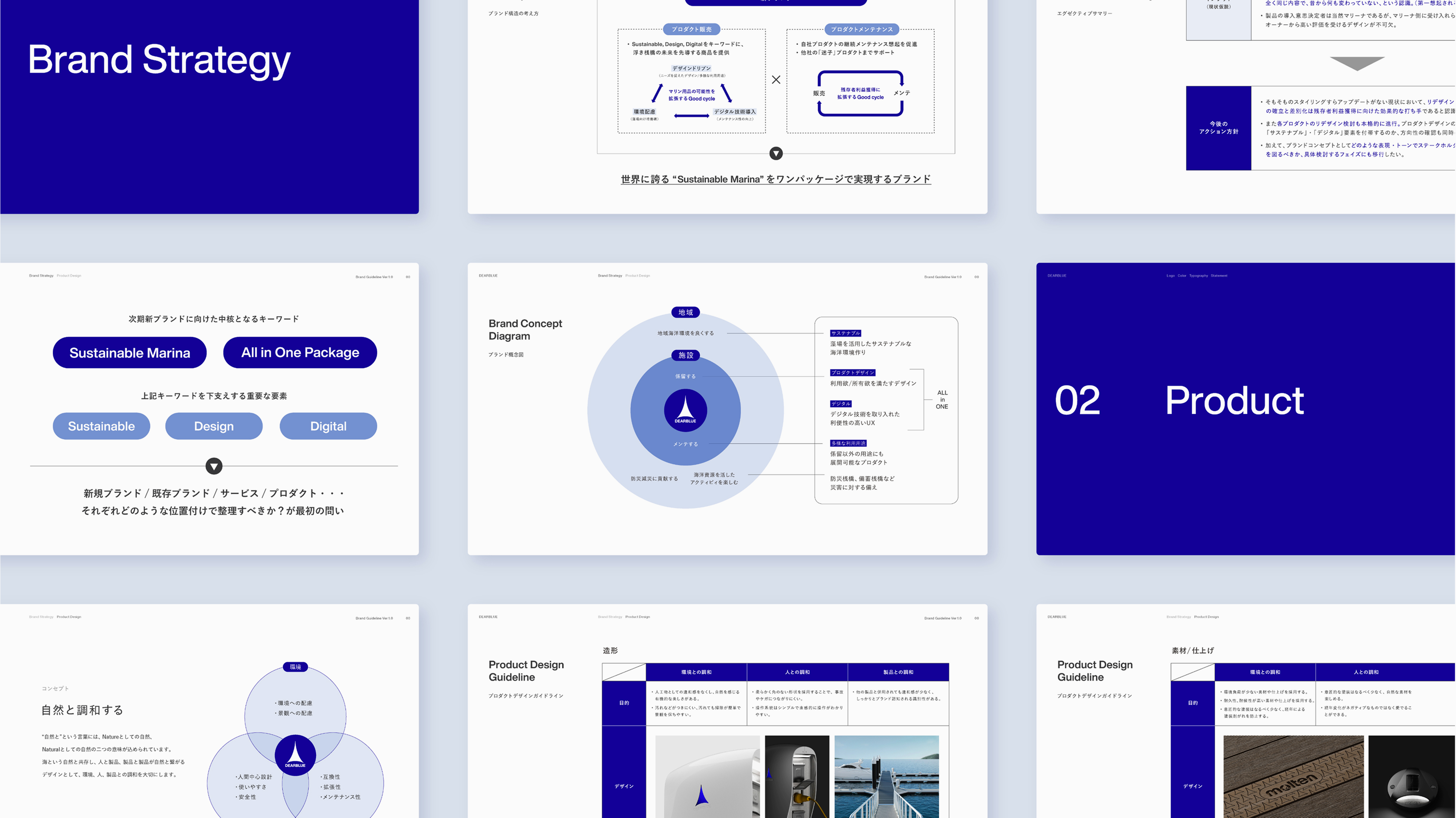
In developing DEARBLUE’s brand strategy, we first conducted external environment research by visiting major domestic marinas. This involved interviewing operators and users, along with on-site observations. Based on actual product usage at marinas, we deepened our understanding of practical operational challenges in marina management, market trends, and the design preferences of users. Simultaneously, to organize the internal environment, we conducted a portfolio analysis of the company’s existing marine product line and interviewed stakeholders, including management, to unify the team’s understanding regarding the new brand’s development direction. Based on these research findings, we clarified the target audience, extracted user insights, articulated the brand vision, and refined the brand concept. Ultimately, we positioned “Design,” “Maintenance,” and “Sustainability” as the core value propositions of the brand and established a development roadmap to realize them. Furthermore, to ensure consistency across all brand communications, we created comprehensive brand guidelines defining elements such as form, materials, and color.
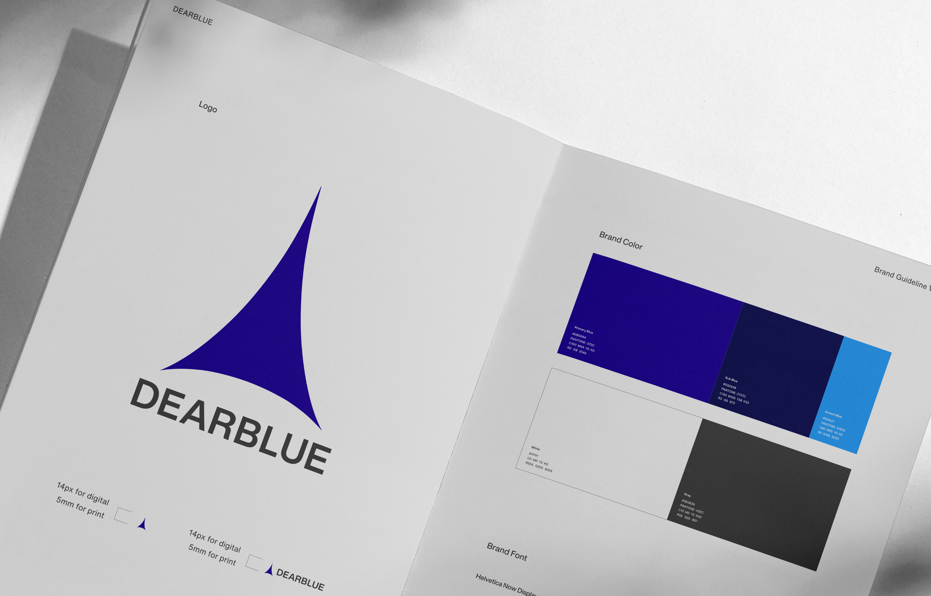
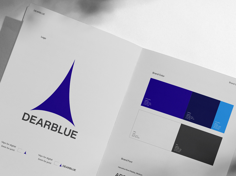
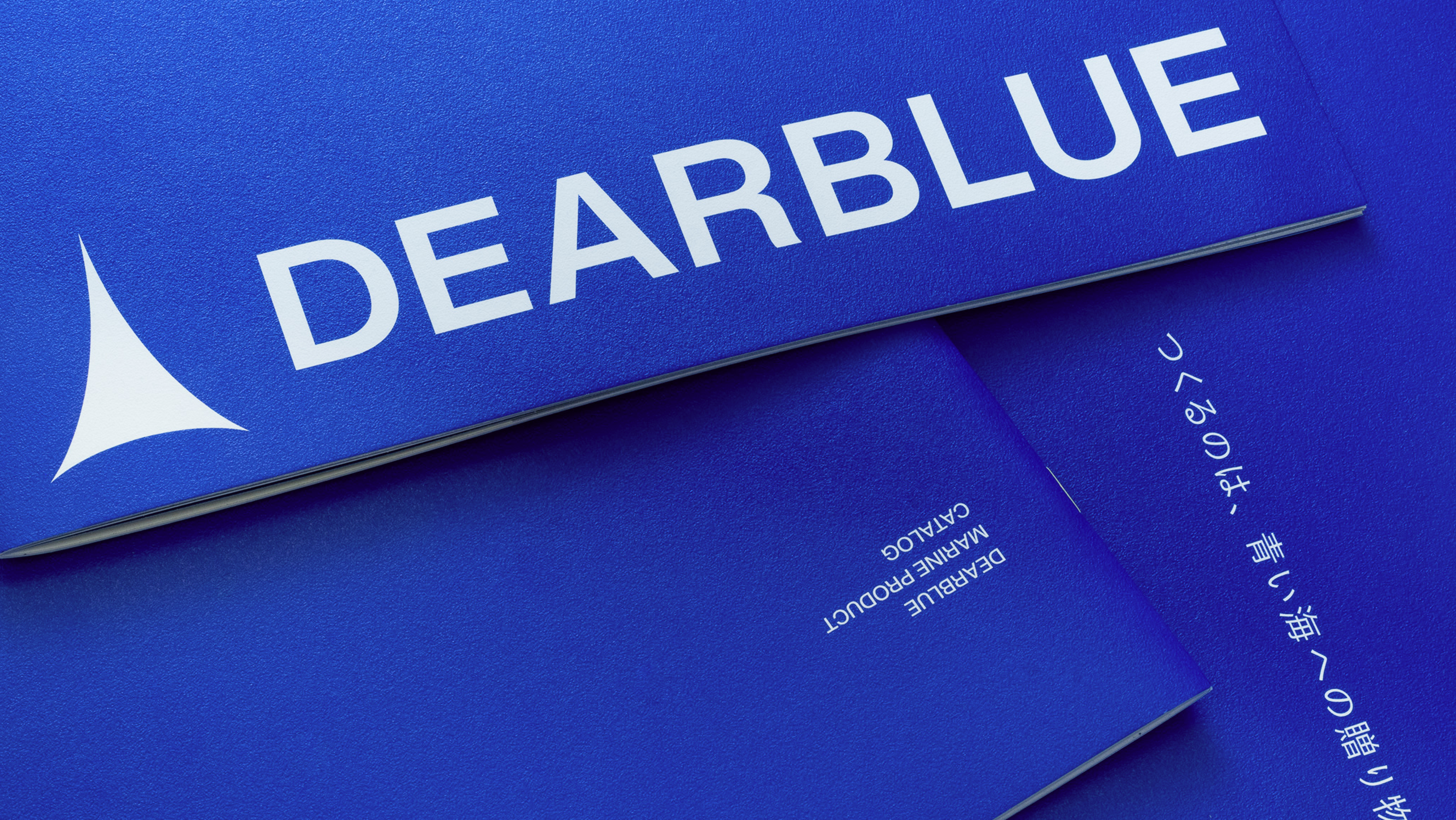
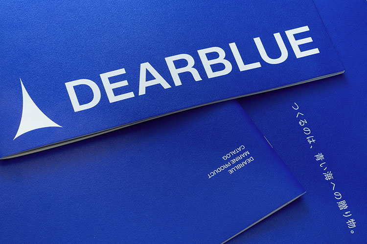
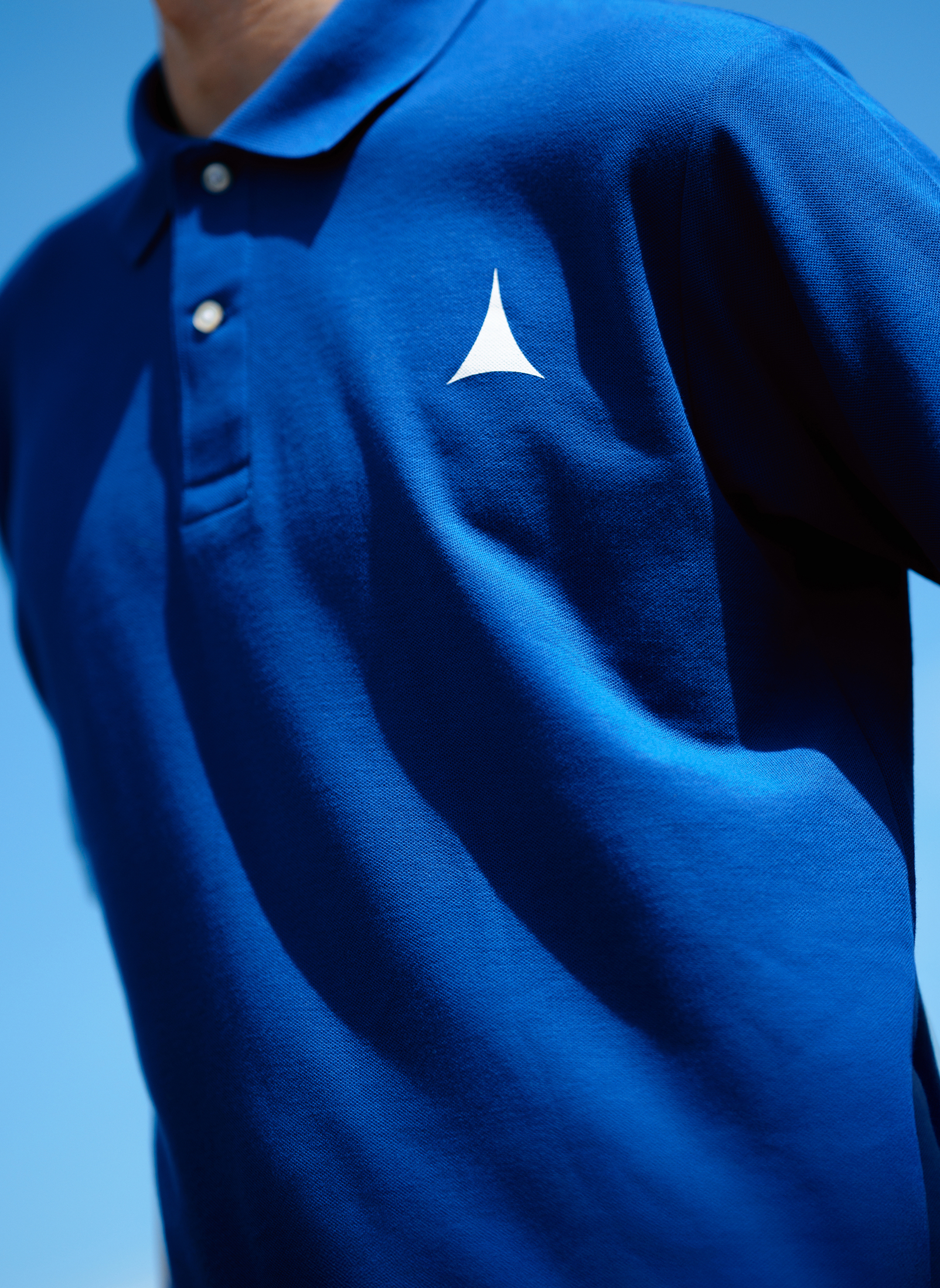
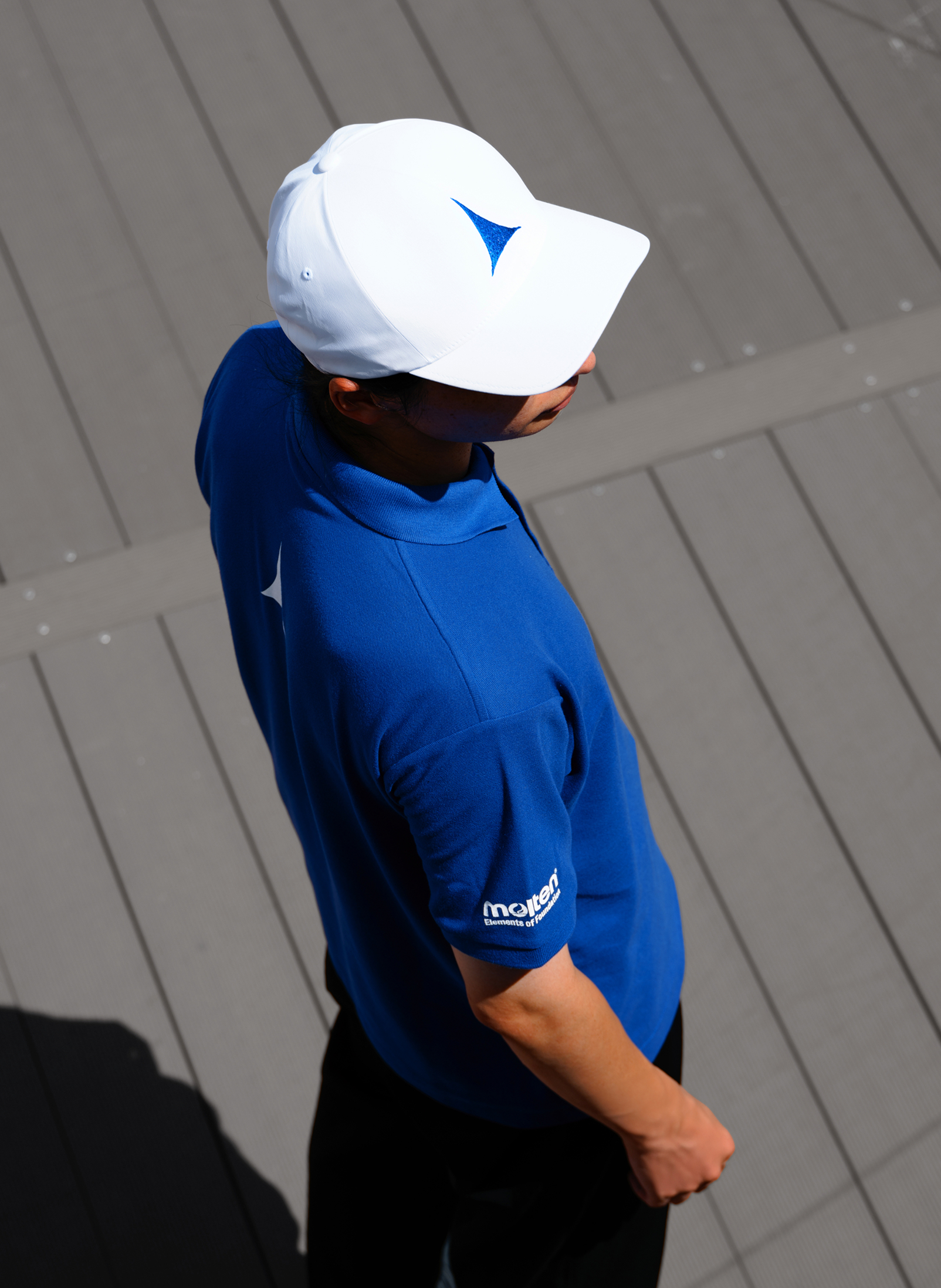
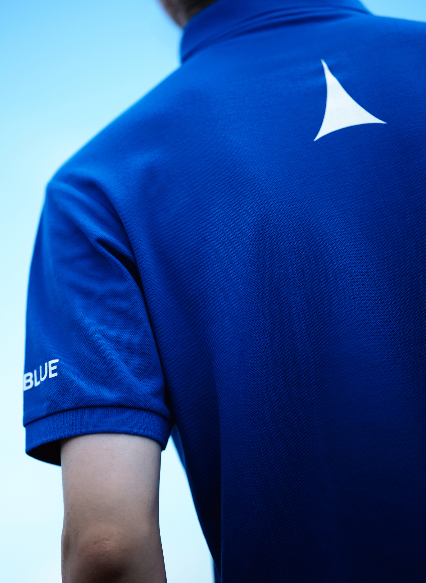
Logo & Tagline
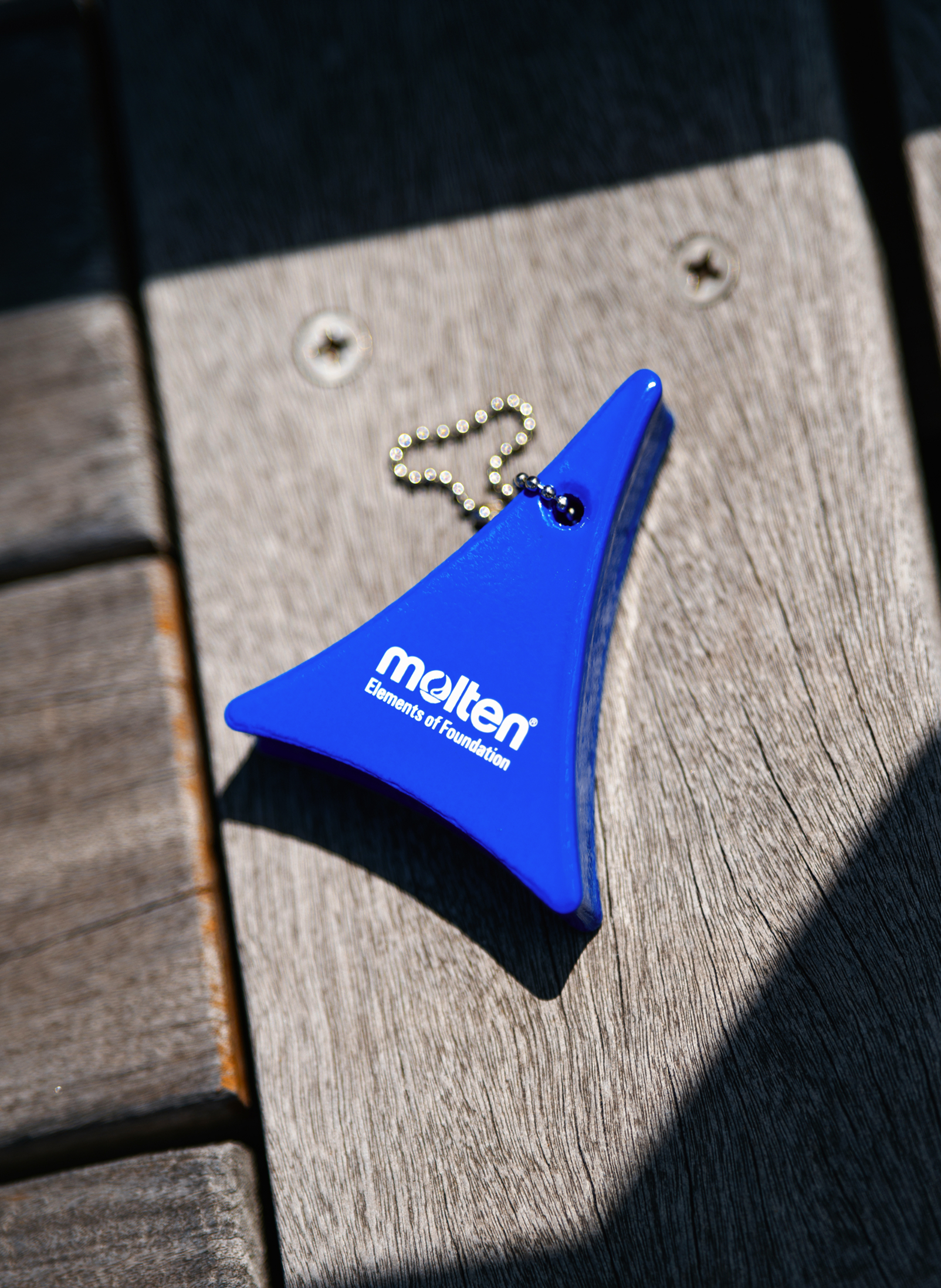
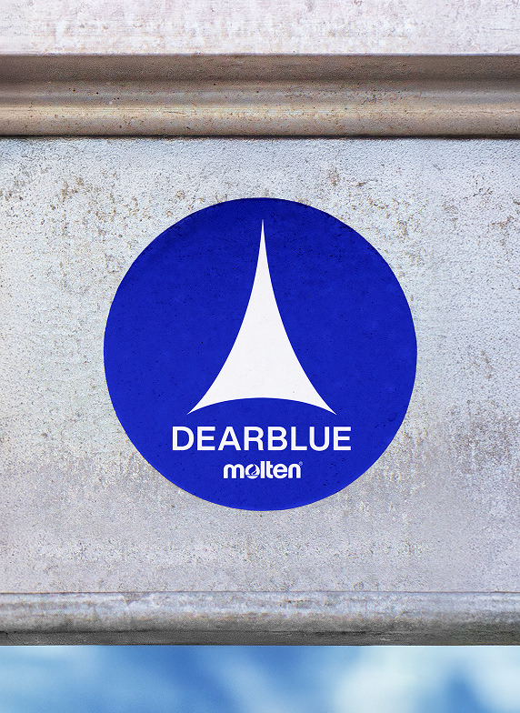
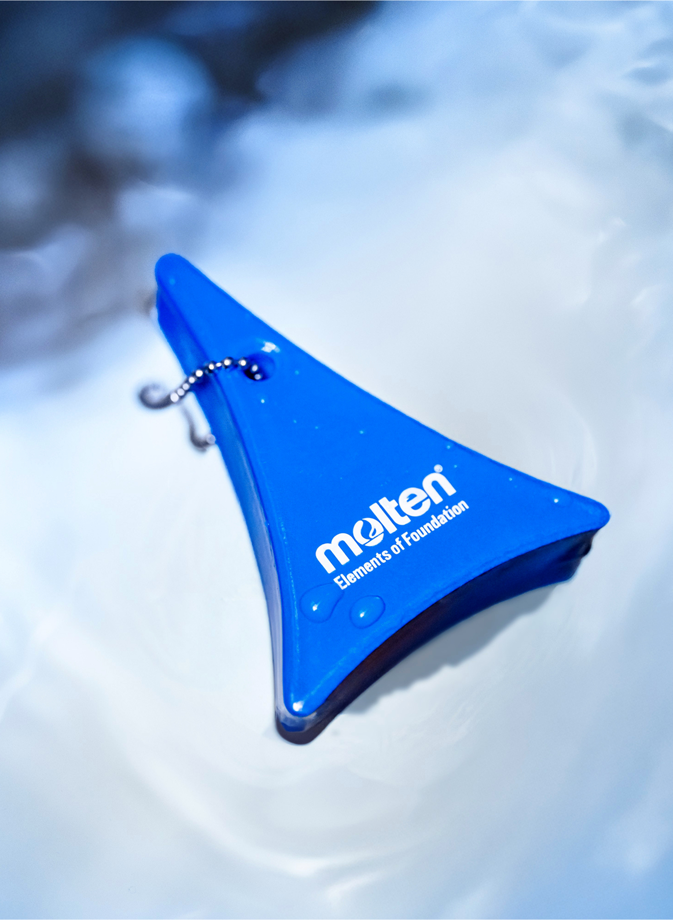
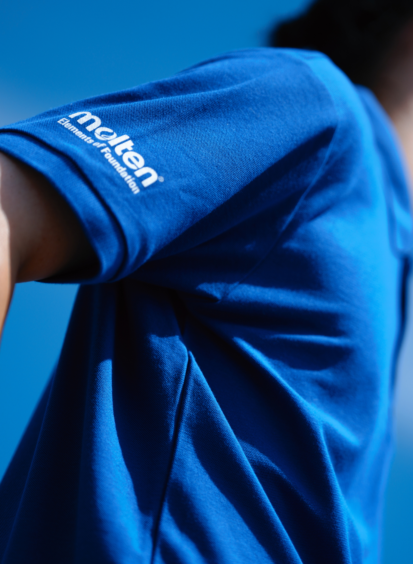
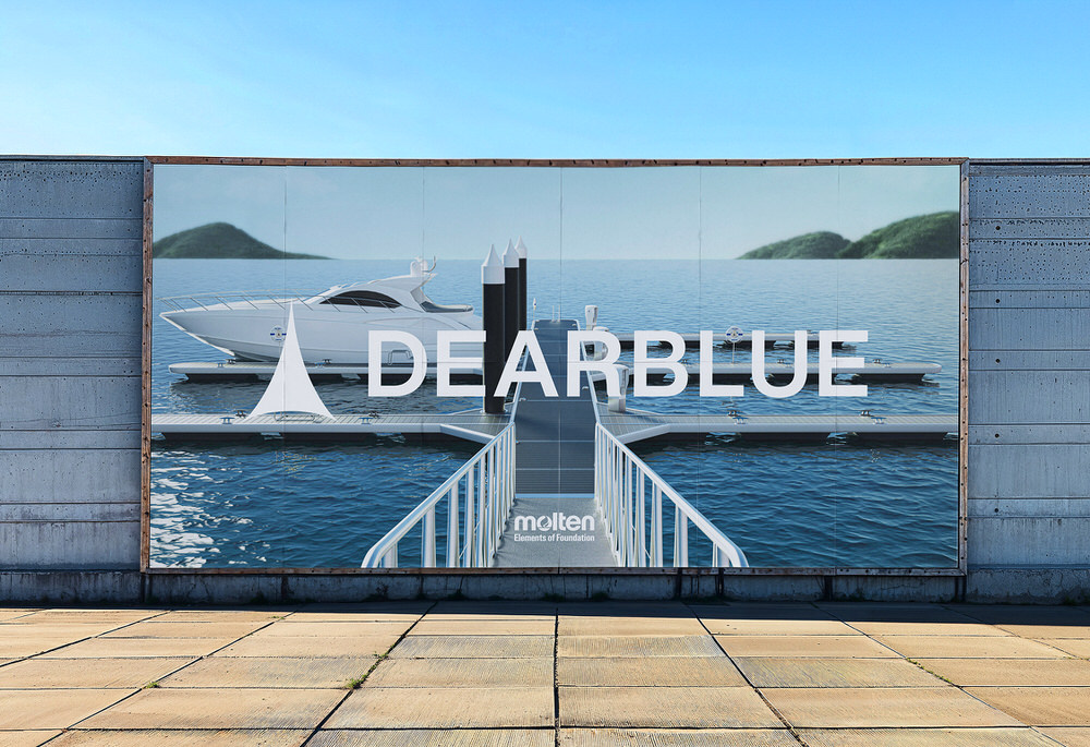
船舶在水面前行时,后方会形成独特的 V 字形波纹轨迹,这一现象被称为「凯尔文波(Kelvin wake)」。DEARBLUE 的Logo以这一航迹图案为灵感,表达品牌在塑造蔚蓝海岸未来的同时,也将以坚实的航迹强势引领行业前行。
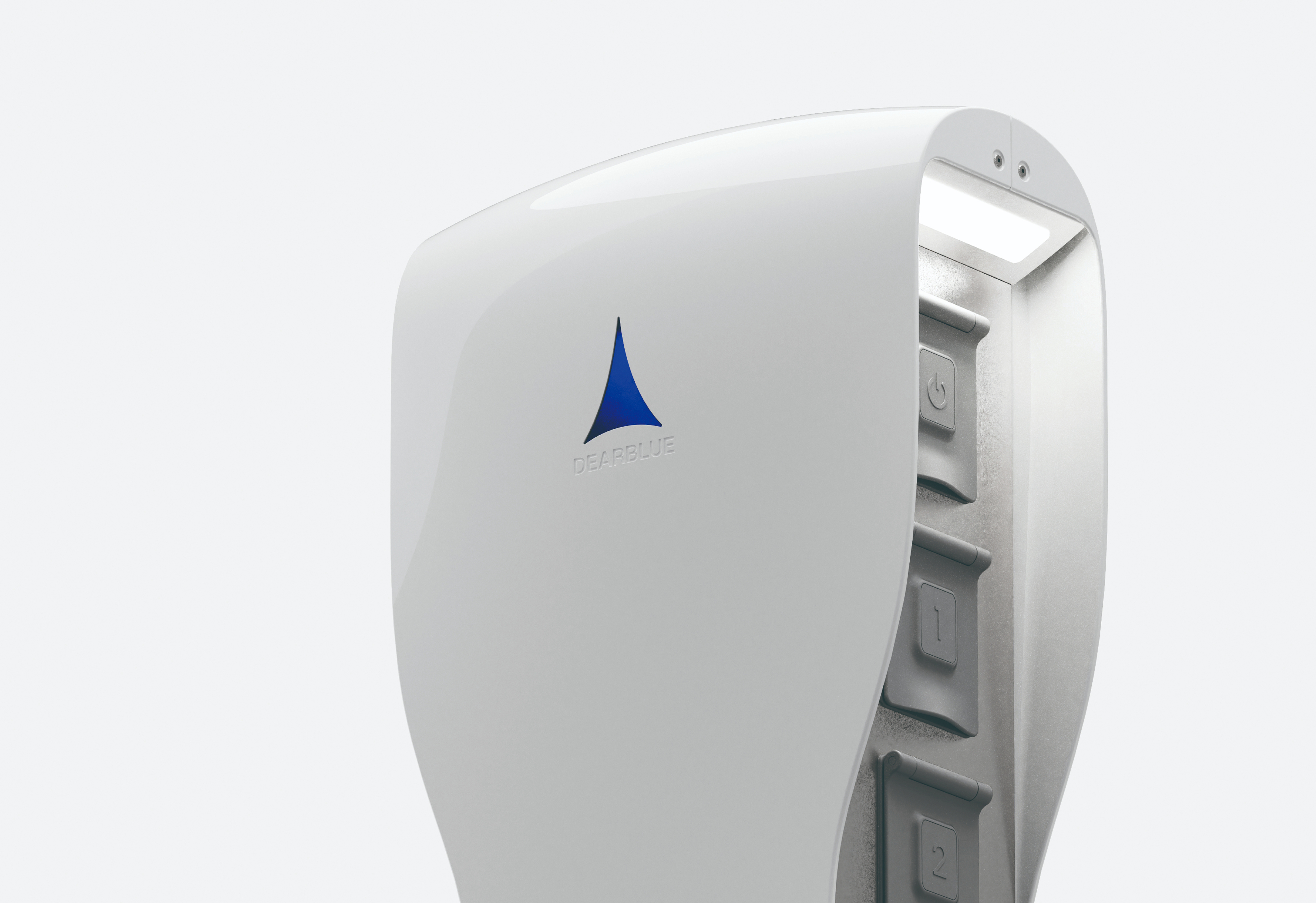
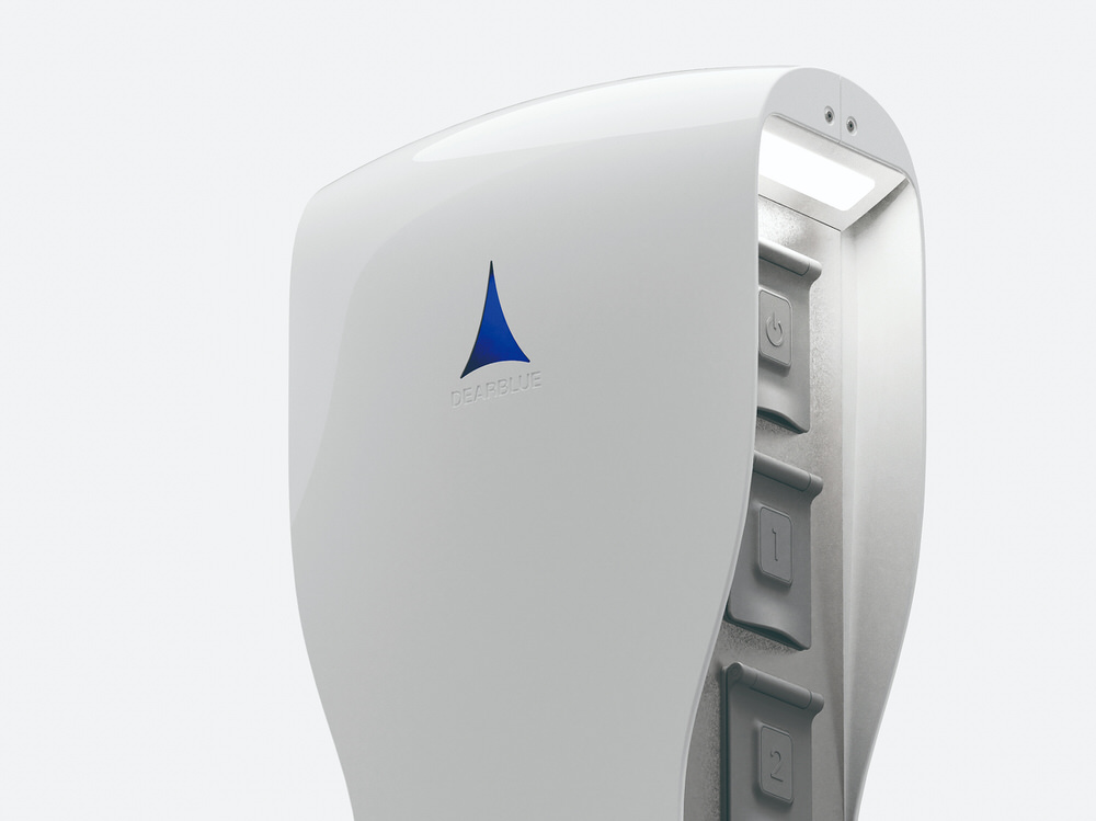
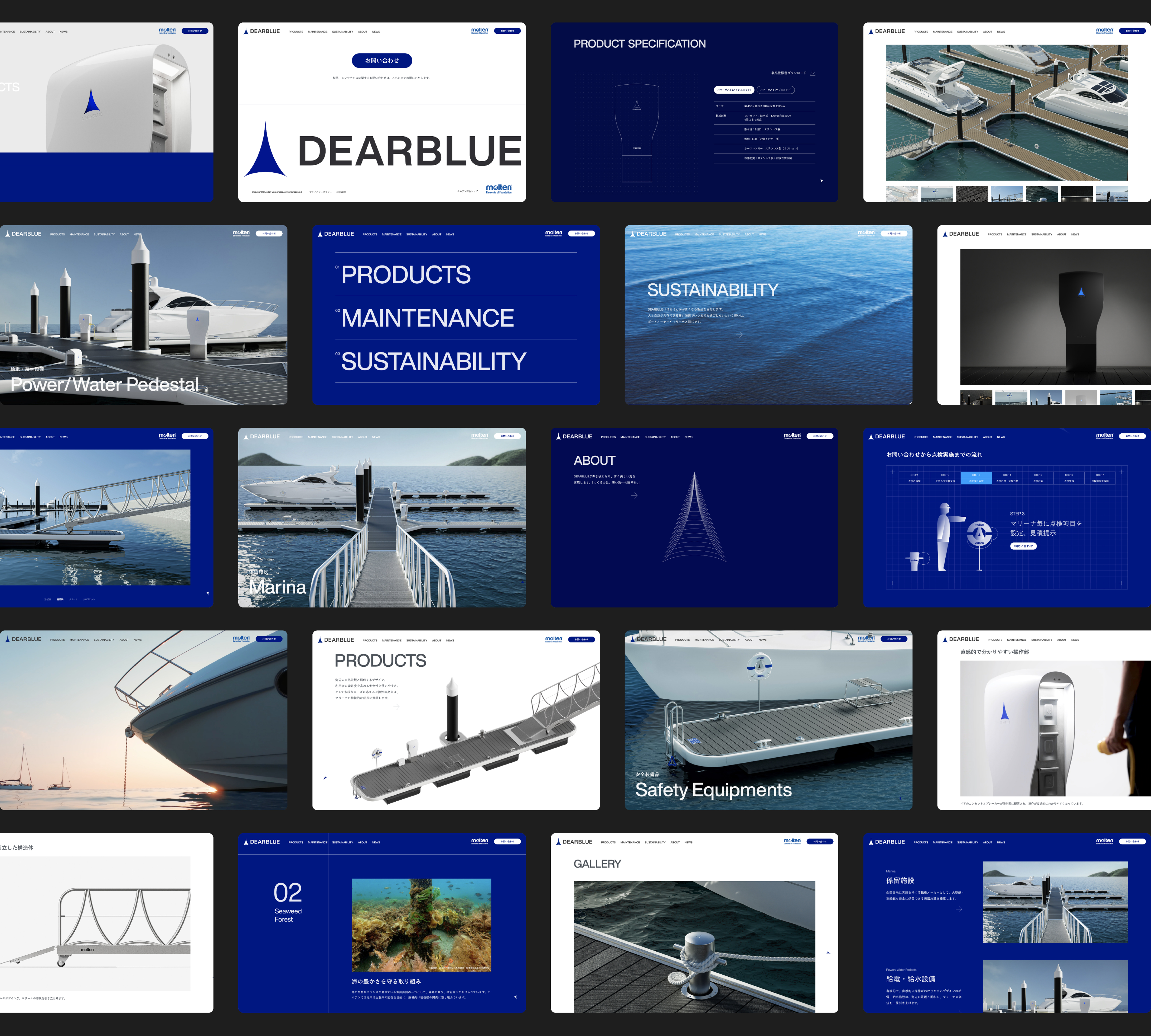
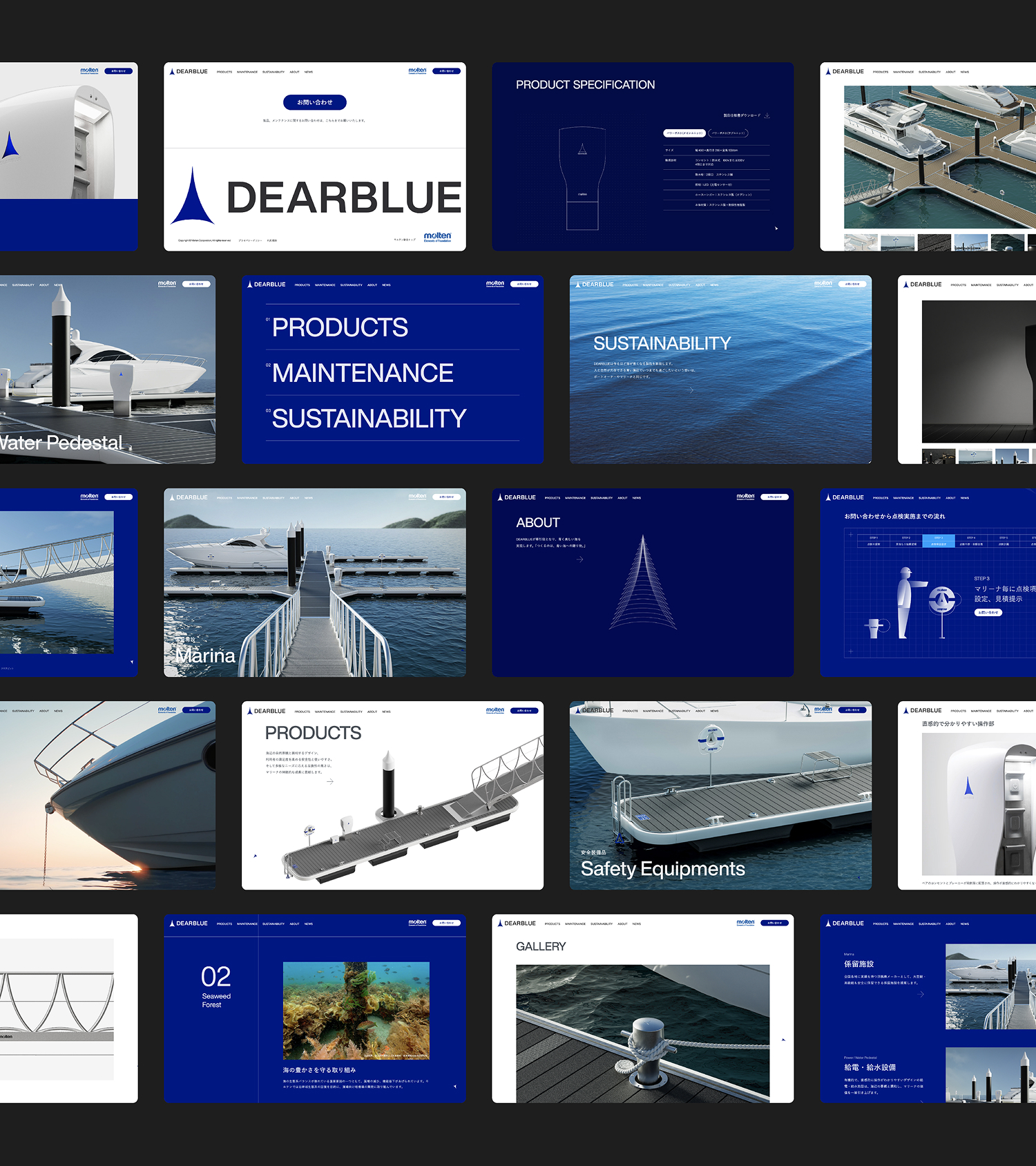
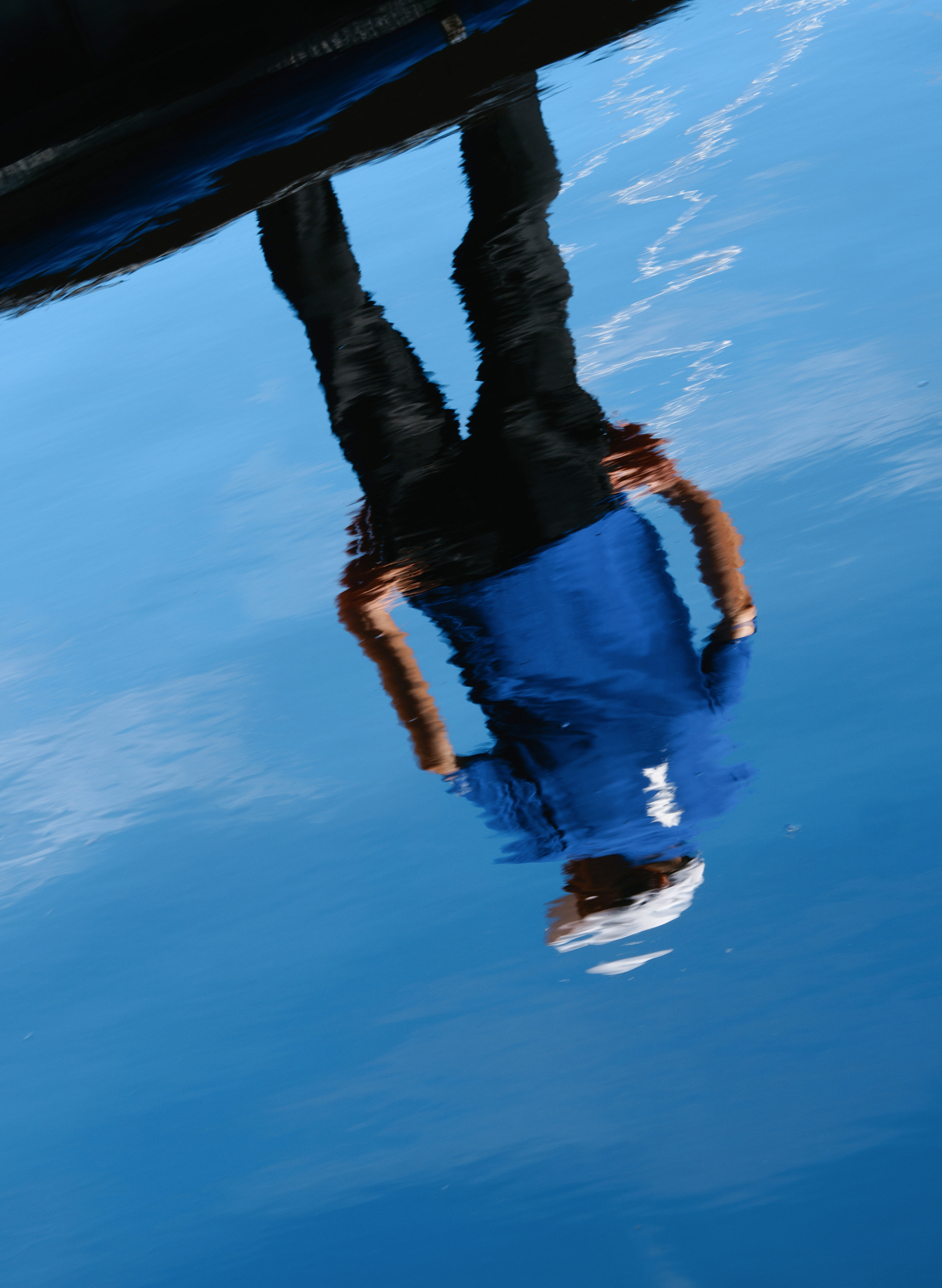
throughout the entire website, we created a bold and sophisticated brand world. The cursor within the site takes the shape of the brand logo, drifting across the screen like a ship. The structure clearly communicates the core values of the three main content areas: “Design,” “Maintenance,” and “Sustainability.” Product pages, in particular, utilize product animations to visually explain the modular structure and installation methods in an easy-to-understand way. Maintenance procedures are also carefully organized with visuals and text, creating a smooth path for inquiries. The main movie on the homepage symbolically features scenery from the Seto Inland Sea, where molten’s headquarters are located. This embodies the brand’s philosophy of living with the sea while conveying DEARBLUE’s determination to become a driving force for the future of marine-related industries from this region.